Per-table QR-code ordering, three years in: what we'd build differently
The pandemic made QR ordering a default. Three years on, the patterns that worked are clear, the dark patterns are clearer, and the temptation to bolt on every clever idea is the thing to resist. A retrospective on the ORDR customer-ordering flow.
By Marta Ruiz
Product design
In the spring of 2020, every restaurant in the United Kingdom learned what a QR code was. Three years after the country reopened, the QR-code-on-the-table is still the most common way for a guest to look at a menu in a casual venue, and an increasingly common way for them to order and pay. The pattern is no longer new. Its norms have settled. The dark patterns have surfaced. And the question we now face — three years after we first shipped QR ordering inside ORDR — is what we would build if we were doing it again today.
This is that retrospective.
What the data says about QR adoption
Pew Research’s surveys on QR-code use and a 2022 Square study of US restaurants both showed roughly the same pattern: adoption climbed sharply during the pandemic, plateaued after, but did not collapse. The behaviour stuck. In hospitality specifically, the National Restaurant Association’s State of the Industry reports have tracked QR adoption as one of the few pandemic-era operational changes that operators kept after restrictions lifted. The reason is simple: it does what it says on the tin. It works.
What is less obvious from the data is which design choices, sitting on top of that QR adoption, succeed or fail.
The pattern that works
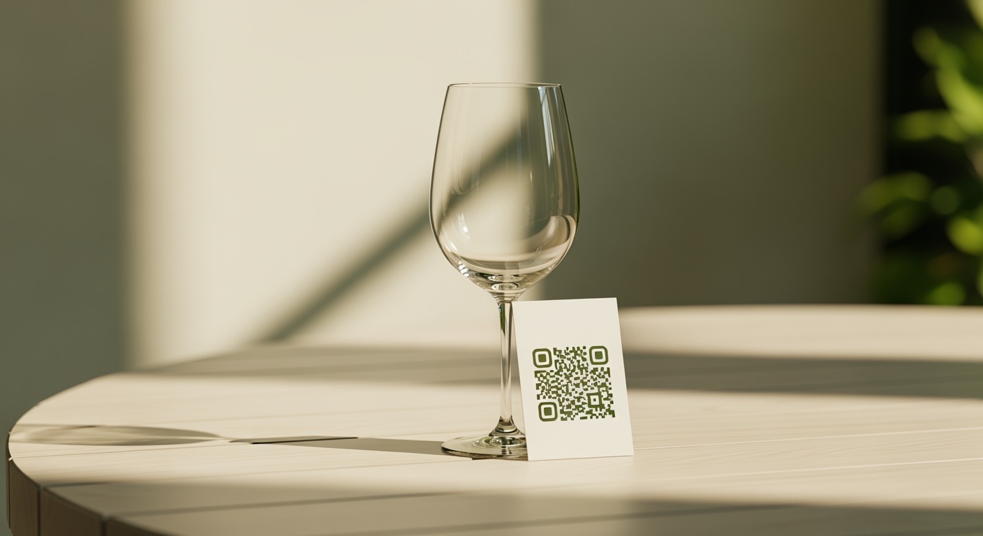
A QR sticker on the table. A short URL. A static menu in the customer’s phone browser. No app install, no sign-in.
That is the entire pattern. It is unromantic. It is correct.
Adding anything beyond it is, with rare exceptions, friction. The customer is at a table with friends, in a noisy room, in a language they may not natively speak, with their phone at maybe 40% battery. Any step you make them take before they can see what soup of the day costs is a step they may not take. The UK Government’s GDS service-design literature is excellent on this — every screen has a tax in attention and time, and you pay it every time you ask the customer to do something before doing the thing they came to do.
The original ORDR ordering flow was, in retrospect, slightly too clever. It tried to capture an email address up front for “receipt purposes”. We removed that. It tried to detect the device language and confirm it. We removed that — detection is fine, confirmation is a step. It asked the customer to choose between “I am at a table” and “I am ordering for collection” before showing the menu. We removed that — the QR code itself encodes which path you are on.
Every removal made the flow faster and the conversion rate (defined as “saw a QR, paid for an order”) materially better.
The dark patterns that have become common
A representative-but-not-exhaustive list, observed across the wider QR ordering market over the last three years:
The 60-second timer to order before “your table is released”. Imposes artificial scarcity. Pure manipulation. Not in ORDR.
The default-on tip slider starting at 20%. Customers who would have tipped 12% are nudged into 18%. Tip nudging works — a McKinsey study on payment-flow defaults shows the effect — but it is not aligned with the customer’s interest, and we have decided we will not optimise for it. ORDR shows the tip field with no default; the customer enters what they would have entered.
The “subscribe to our newsletter to see the menu” gate. Surprisingly common. Surprisingly bad. We have never shipped this and never will.
Auto-adding service charge of 15% with a “remove” link in two-point grey type at the bottom of the bill. Legal in the UK, if disclosed. Not what we do. ORDR’s service-charge UI is plainly visible and the toggle is the same size as every other toggle on the screen.
Harry Brignull’s “Deceptive Design” archive catalogues these patterns generally; the QR ordering flow has reproduced almost every one of them in some form. The right move, as the platform that the venue uses, is to refuse to ship them by default.
What we would build differently if we were starting today
Skip the cart concept entirely for at-table use. The current flow is roughly: browse → add to cart → review cart → pay. Three years in, the friction is in the review cart step. For at-table ordering, the cart is redundant — the customer is already at a table, the bill already exists, items get added to it. The cart belongs to takeaway, not at-table. We have started moving the at-table flow to a single tap → “added to bill” with an instant visible-in-the-corner micro-confirmation. Less to look at, faster to use.
Treat the QR sticker itself as part of the design system. Most venues print their own QR stickers, often badly. We now ship printable PDF templates that match the venue’s branding by default, and we recommend a specific size and laminate. A QR sticker that looks like it was photocopied at a service station damages the trust before the customer has even tapped the link. The literature on first-impression design effects — Nielsen Norman Group is the canonical source — is consistent on this point.
Build the offline fallback first, not last. The venue’s wifi will drop. The customer’s signal will drop. The flow needs to degrade gracefully — a printed menu accessible via the same QR even when the dynamic version cannot load. We added this in late 2023; it should have been there at launch.
Default to the venue’s language, not the customer’s. A surprisingly contrarian design choice that has worked well. Detecting and switching to the customer’s device language sounds polite, but it confuses staff who help with the order at the table — they expect to see the same screen as the customer. We default to the venue’s primary language with a language switcher at the top of the menu, and we have measured it: order completion is materially higher this way.
When you still want staff-led ordering
QR-led ordering is not always the right answer. Fine dining wants the conversation. The pre-theatre rush wants the speed of an experienced server. Bars at midnight want the friction of “ask the bartender” because that friction is the relationship. ORDR has always supported both modes, and the choice is per-venue, not per-product.
Restaurant Online’s surveys of UK casual-dining customers consistently show that the customer’s preference is “give me both, let me choose” — sometimes I want to tap, sometimes I want to chat to the waiter. The platform that imposes one mode on every guest is the platform that loses guests.
What ORDR does about this
ORDR’s at-table ordering flow has been continuously simplified for three years. No app install. No email gate. No defaulted tip. No dark patterns. The full customer-ordering documentation is in the help centre — and the underlying design principles travel into the upcoming staff app rework: speed and clarity first, cleverness second.